Mohawk Paper Company
promotional
Mohawk Paper Company provided my class the opportunity to re-design a set of info materials the compamy distributes to interested parties, called Ask Mohawk. The materials include large quantities of dry content about papermaking, printing, and envelopes. Not exactly a page turner, but important information for printers and designers to know! The class then voted on a project to be featured on Mohawk’s Felt & Wire blog—mine was chosen!
The Green Line.
Mohawk Paper Company has set a green precedent in the paper industry. They make every effort to continue ensuring that their process is as environmentally sustainable as possible, and work to find new, more sustainable options for paper. In fact, since this project was completed, Mohawk has released a line of sustainable papers made from hemp, straw, and recycled cotton called Mohawk Renewal. Check it out here.*
*This is not sponsored I just love Mohawk Renewal :)
The Original Ask Mohawk Promotional Pieces:
form & function.
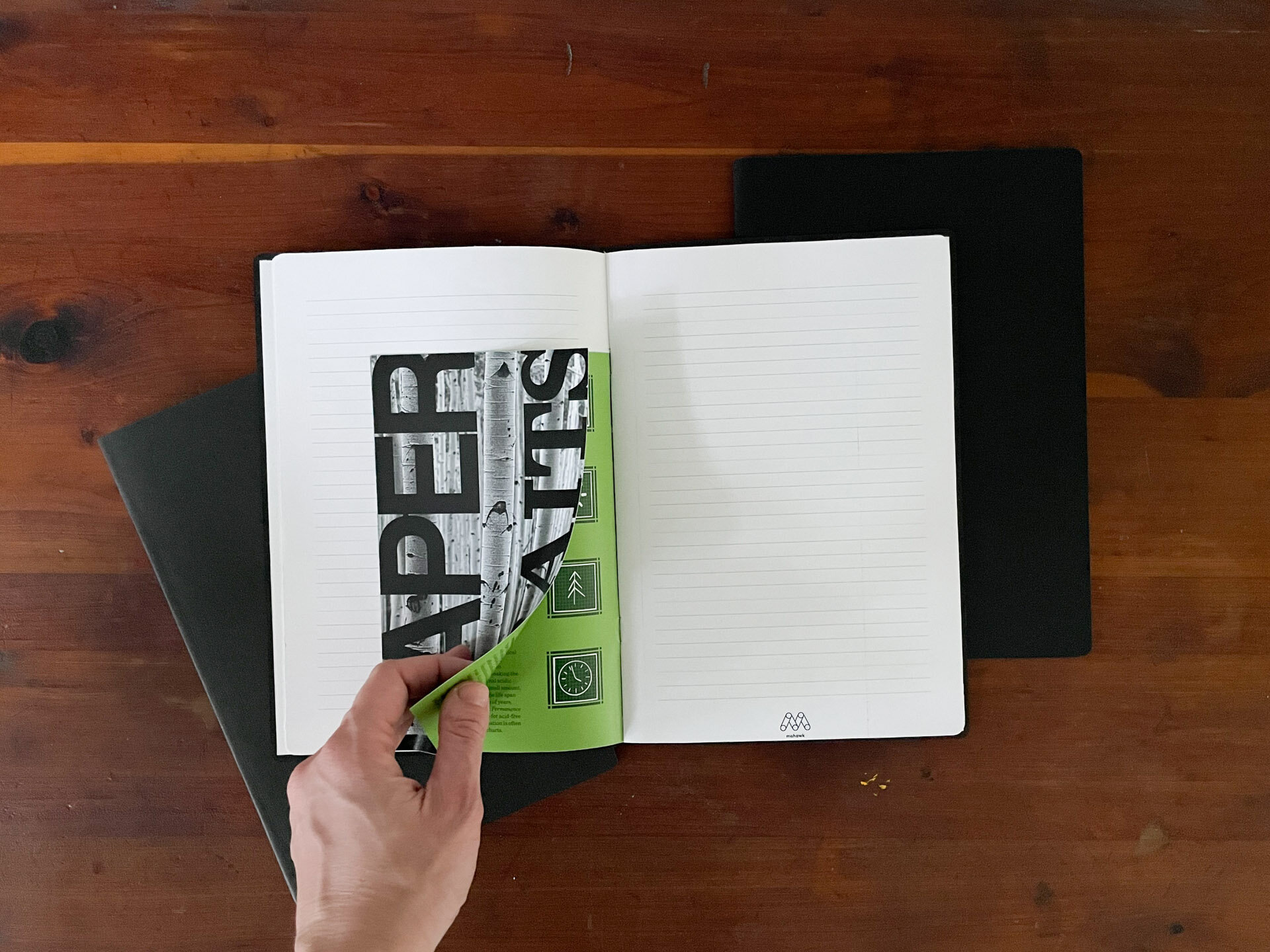
The existing Ask Mohawk Pieces were an excellent educational resource, but why stop there? Something that every printing and printing-adjacent professional uses is notebooks. If Mohawk is going to distribute a print resource, let’s extend the life of that piece of paper as far as we can! I decided to create a set of notebooks: One with blank paper, one with lined paper, and one with grid paper, that would enclose the Ask Mohawk information in a series of “Short Sheets” or small inserts set between the pages in each notebook.
The cover of each notebook dons a blind emboss (I could not mock up a blind emboss as a sophomore in college, so use your imagination) of Mohawk’s logo mark and highlights a different textured paper mohawk produces: Mohawk Carnival Groove cover stock, Mohawk Loop Laid cover stock, and Mohawk Via Linen cover stock.
Friendly Reminder
The idea behind these short sheets is that the information would be broken down into more digestible portions. In the original pieces, there are pages of floor-to-ceiling text. While this is perfectly fine in the right context, my goal was to make this information more palatable, more accessible. Splitting up the content amid notebook pages also provided a great method of periodically reminding the user of Mohawk. As a designer using this notebook, it would be difficult for me not to think of Mohawk first for my paper needs.


