Oho Wax Co.
product concept
brand strategy
brand identity
packaging
ad series
Oho Wax Company is easygoing, low-key, and carefree with a side of tradition. It calls back to the roots of surfing with a focus on connection between the athlete and the ocean. This project was my first attempt at environmentally-conscious packaging. While there’s plenty that I would change about it now, it sparked an important interest in me for products and packaging that go the extra mile.
oho.
The prompt for this assignment was to create a brand, product, packaging, and ad series based on the word oho. Oho is an exclamatory word, indicating excitement. As I thought about when one might use this word, I thought about the feeling of dropping into a wave, of my stomach dropping and an involuntary “Oho!” spilling out of my mouth. I decided to create a surf wax brand that embodies this sensation.
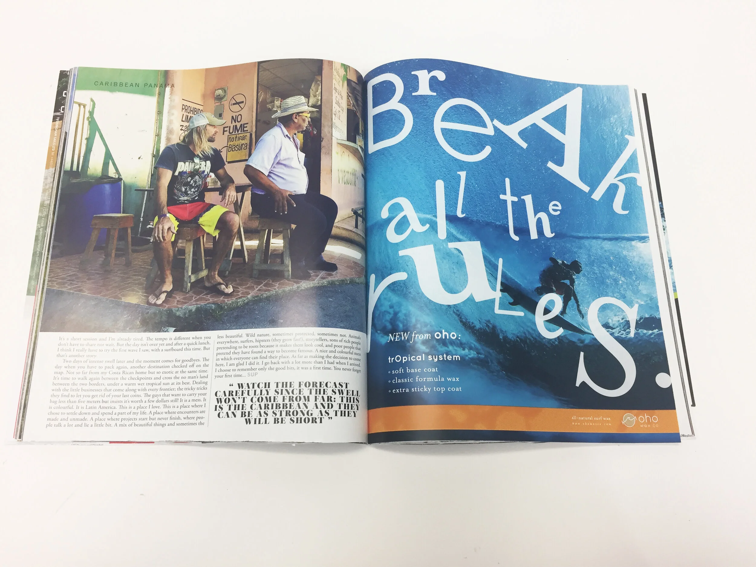
Break all the rules.
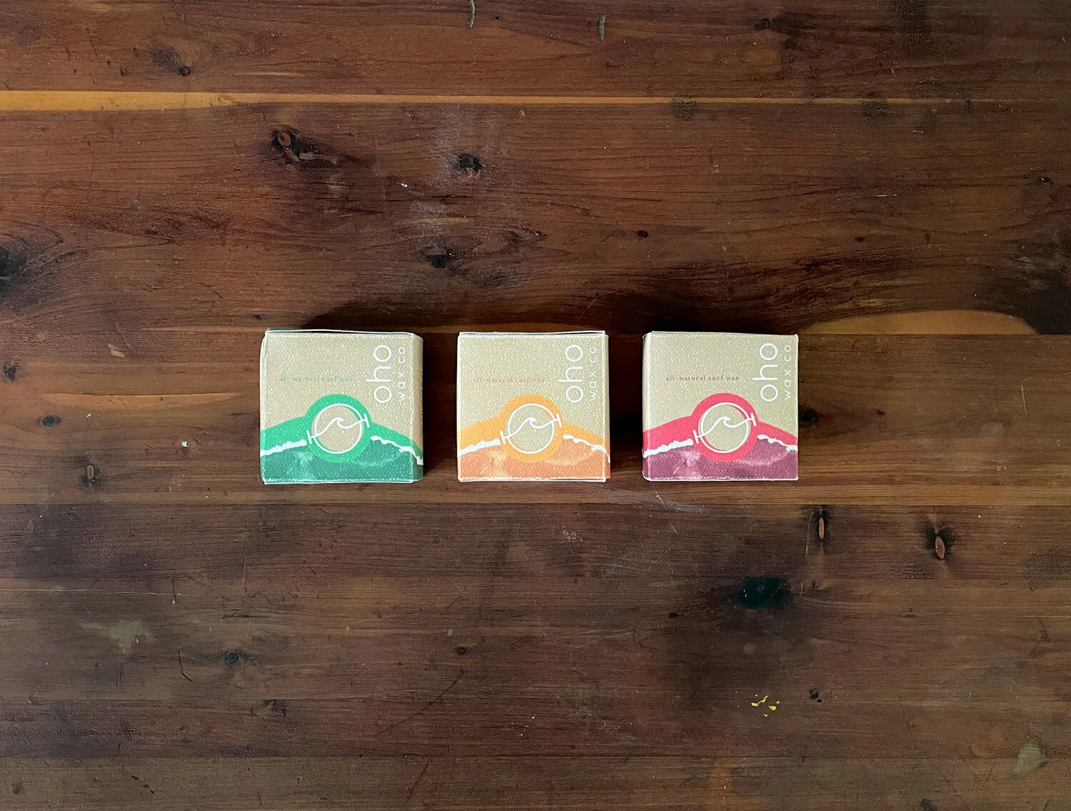
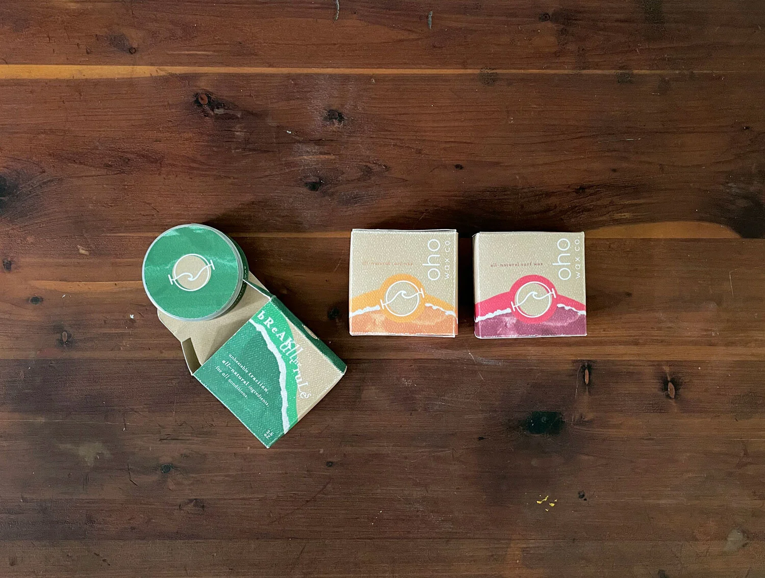
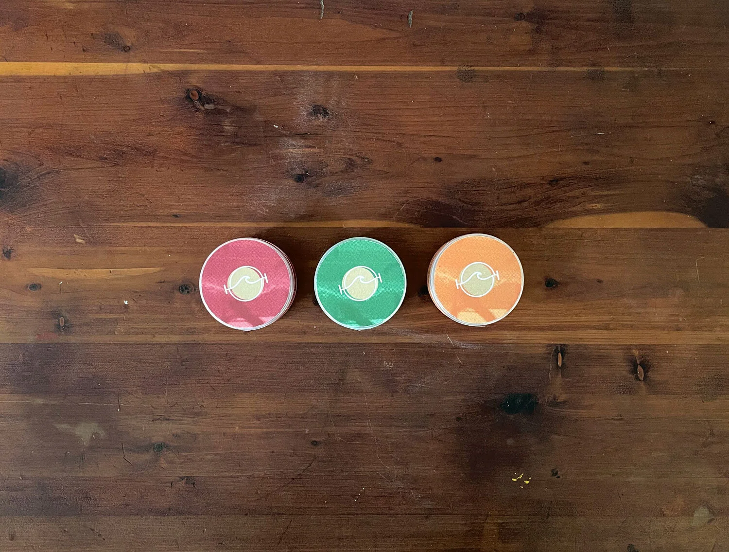
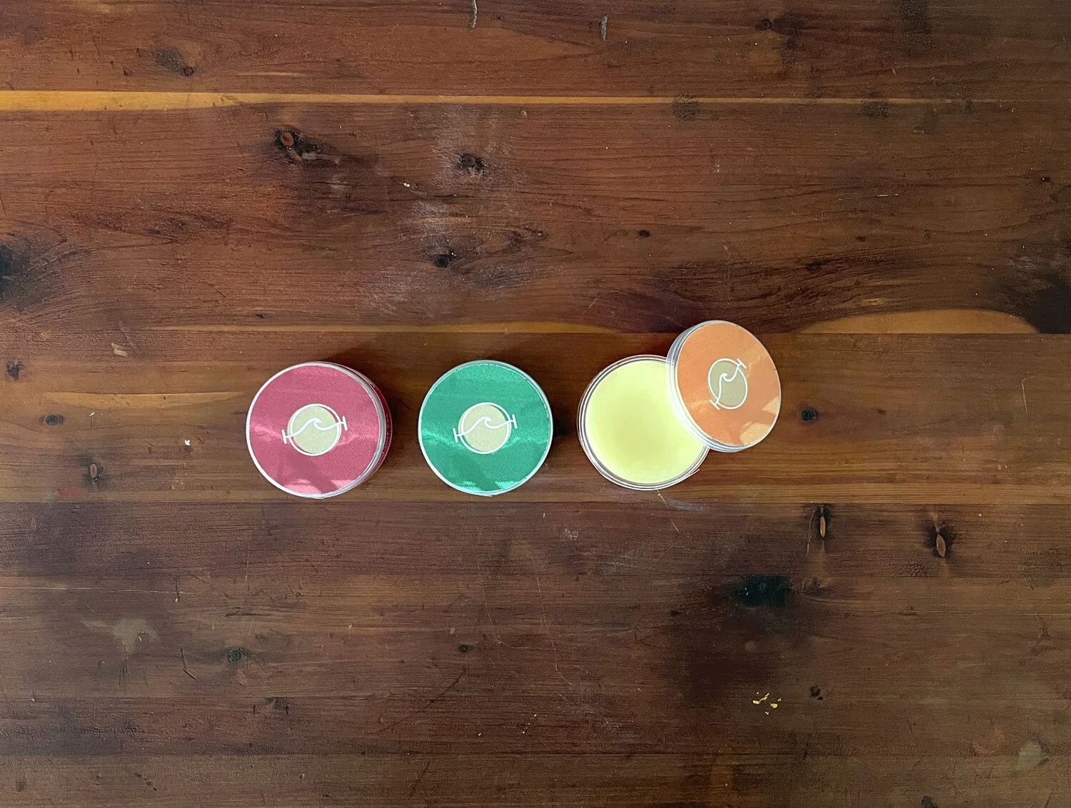
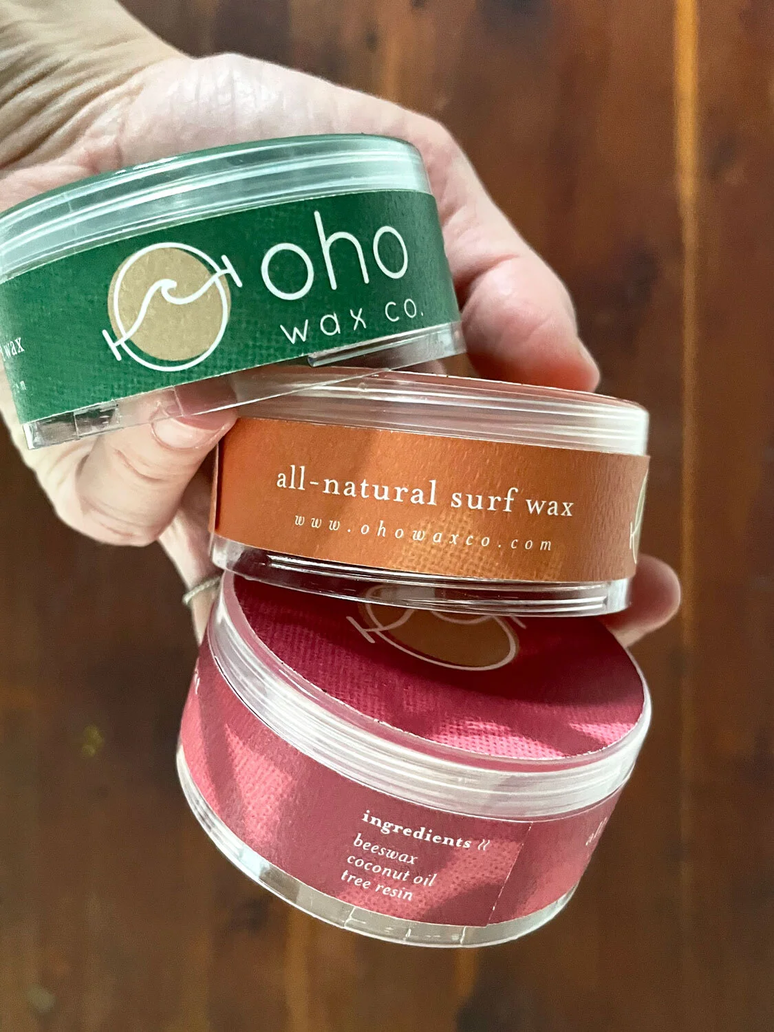
Oho’s mantra is “Break All The Rules.” Their business model aims to minimize waste in every possible way, no matter the cost. Their outer packaging is a simple, uncoated cardstock box with art printed using soy-based ink. The interior packaging is a reusable plastic tub made from ocean-bound plastic. The sturdy tub with screw-on-lid allows users to throw Oho Wax in their bag without a mess and buy refill pucks (at a lower price!) that pop into the same tub over and over again.
chaotic calm
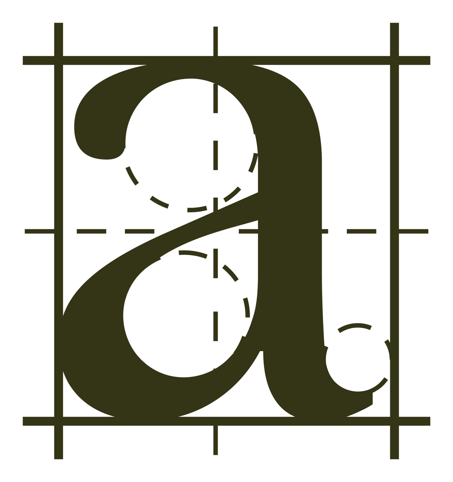
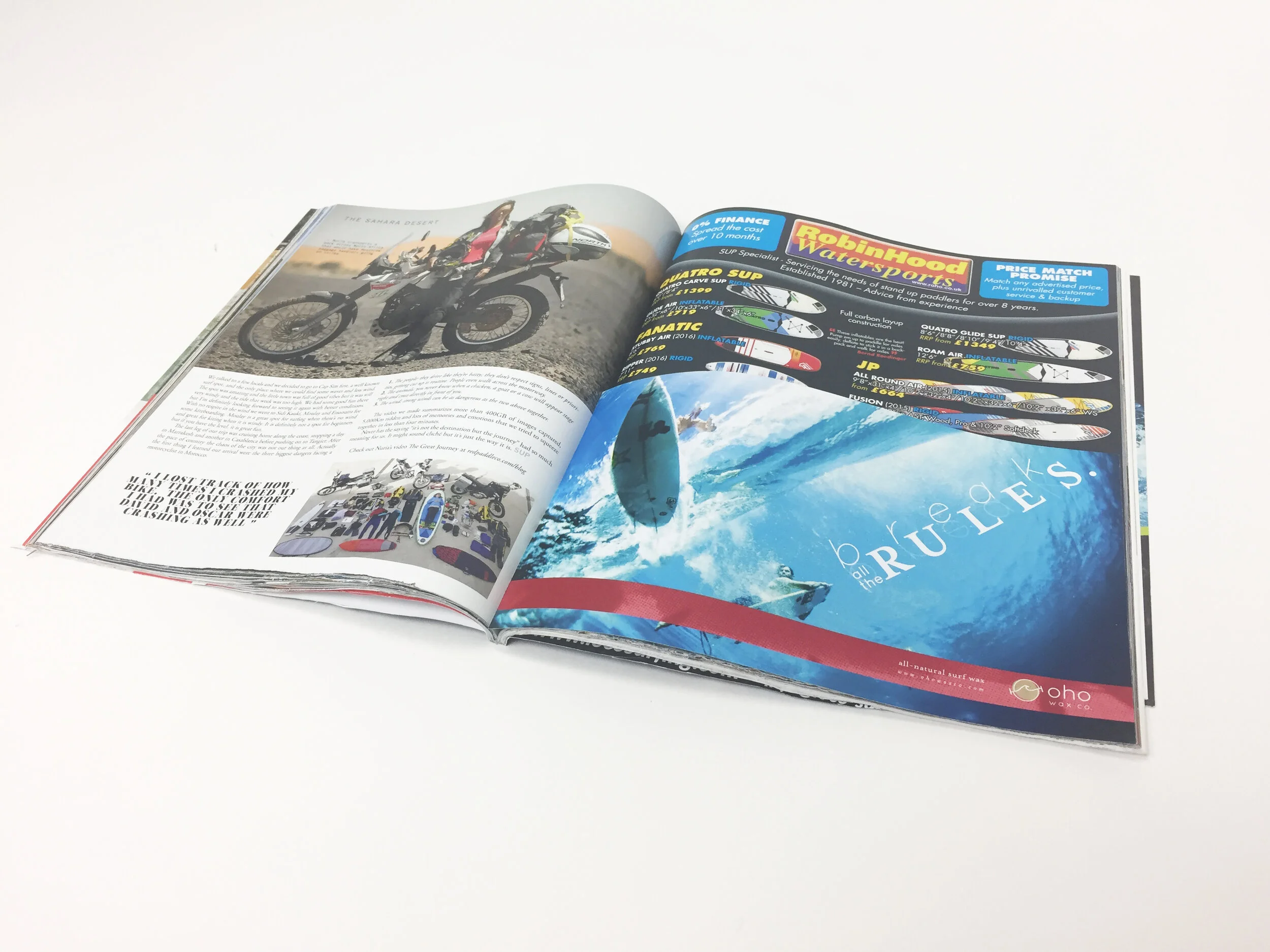
I was reaching for a chaotic calm when I designed this brand. Oho’s logo mark is very round and stable, as are the logotype and primary typeface, but have hints of movement—if you look closely. The circle holding the wave in the logo mark is slightly offset, simulating the movement created by the wave. The “x” in “wax” is also a wave—more of a spilling wave than a crashing wave—that keeps you moving just as you begin to lock in on the logo. This same wave-like movement appears throughout the brand’s imagery—in the torn paper on the back of the box, in the photos curated for the ad series (below), and in the tumbling tagline typography placed throughout.
trust the process.
I had a particularly good time exploring for this project. If you’d like to take a look into the scatters of my mind…
